What Is Data Preparation?
Data preparation is the act of manipulating raw data into a form that can readily and accurately be analysed, e.g. for business purposes.
Extract Transform and Load (ETL) is the general procedure of copying data from one or more sources into a destination system. This system then represents the data in a different format which is visually compelling to the user.
To improve integrity the data undergoes a process of normalisation and cleansing, whereby duplicates are removed, and missing information is completed. The final improved data set is then loaded into a single source database system, often referred to as a Data Warehouse.
Business Intelligence Analysts use this single data source to prepare business insights in the form of reports and dashboard views.
Why Data Sources Are Important
As data accumulates, managing it can start to become quite complex. Traditional methods of discovering patterns in large data sets, such as Data Mining, can make the analytical process slow, unreliable and subject to inconsistency.
As a business leader you need to have absolute confidence in the data insights you are presented with. The future of your business depends on well informed decisions. Analysts providing the insights to you also need to be confident that the data is accurate.
Disparate data sources create problems when trying to spot overall data trends. For example; customer contact data in a CRM system may be separated from the data related to their purchasing behaviour, which is held in an accounting system. This can result in a disjointed overview of those customers.
Today’s Business Intelligence solutions provide a ‘self-service’ data preparation model. This is beneficial because it reduces the burden on your IT department. It also ensures that security and governance are at the core of your data process.
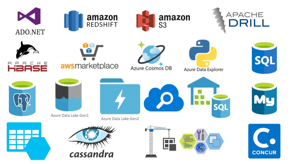
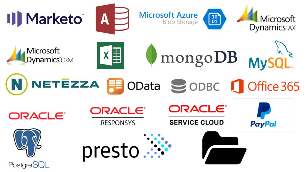
Data Sources We Work With

- Ado.NET
- Amazon RDS (all types)
- Amazon S3
- Apache Drill
- Apache HBase
- Azure Cosmos DB
- Azure Data Explorer
- Azure Database for MySQL
- Azure Database for PostgresSQL
- Azure Datalake Gen1
- Azure Datalake Gen2
- Azure Search
- Azure SQL Data Warehouse
- Azure SQL Database
- Azure Table Storage
- Cassandra
- Common Data Service for Apps
- Concur

- Couchbase
- Dynamics 365
- Eloqua
- Flat Files
- FTP
- Google AdWords
- Google BigQuery
- Greenplum Database
- Hadoop
- Hadoop HDFS
- Hive
- HTTP Endpoint
- Hubspot
- IBM DB2
- Impala
- Inormix
- Jira
- Magento
- MariaDB

- Marketo
- Microsoft Access
- Microsoft Azure (Blob Storage)
- Microsoft Dynamics AX
- Microsoft Dynamics CRM
- Microsoft Excel
- Mongo DB
- MySQL
- Netezza
- OData
- ODBC
- Office 365
- Oracle
- Oracle Responsys
- Oracle Service Cloud
- PayPal
- PostreSQL
- Presto
- Standard File System
Benefits To You
Business User Enablement – provide users with powerful analytical insights without the need for IT support
Control – reusable transformation rules increase efficiency
Data Quality – improved quality right from the beginning of the process
Speed – automating this lengthy and manual process saves you time and money
Transformation – immediate value from your data by creating business specific standards and formats
What Is Data Visualisation?
Data visualisation is the graphic representation of data in the form of images and charts.
Presenting data in this way is aesthetically pleasing and easier for users to interact with. As the saying goes ‘a picture speaks a thousand words‘ but don’t just take our word for it, see for yourself:
Let’s take a look at this spreadsheet data showing coffee sales by country per month.
| Year/Month | Bolivia | Ecuador | Madagasca | Papua New Guinea | Rwanda | Average |
|---|---|---|---|---|---|---|
| 2004/05 | 165 | 938 | 522 | 998 | 450 | 614.6 |
| 2005/06 | 135 | 1120 | 599 | 1268 | 288 | 682 |
| 2006/07 | 157 | 1167 | 587 | 807 | 397 | 623 |
| 2007/08 | 139 | 1110 | 615 | 968 | 215 | 609.4 |
| 2008/09 | 136 | 691 | 1026 | 1026 | 366 | 649 |
Interactive Chart
Here is the same data, this time displayed as an interactive chart.
| Month | Bolivia | Ecuador | Madagascar | Papua New Guinea | Rwanda | Average |
|---|---|---|---|---|---|---|
| 2004/05 | 165 | 938 | 522 | 998 | 450 | 614.6 |
| 2005/06 | 135 | 1,120 | 599 | 1,268 | 288 | 682 |
| 2006/07 | 157 | 1,167 | 587 | 807 | 397 | 623 |
| 2007/08 | 139 | 1,110 | 615 | 968 | 215 | 609.4 |
| 2008/09 | 136 | 691 | 629 | 1,026 | 366 | 569.6 |
Which format do you think provides the most insight?
The spreadsheet is merely a table of numbers. The chart however, shows colour coded data, average line plotted, and an immediate visual comparison of past and future year/month figures. Users can also zoom in/out and highlight/select specific products.
If you think the chart functionality is impressive, we can assure you that data displays get a lot more interesting when you add dashboards into the mix!
If you would like to find out how we can transform your data into stunning visualisations, please contact us.
