It’s a tough break for modern software applications. To be considered a catch they need to have it all: good looks, brains and wealth!
That’s why great dashboards with visually stunning insights, actionable information and rich analytics are a key requirement.
The question is: “How do you transform puzzling data into transparent and meaningful business decisions. Actions that resonate with users?”
Too much swagger with limited practicality is the classic ‘style over function’ trap.
Effective dashboards require a careful selection of useful data. Striking a balance between being sufficiently actionable and overly cumbersome to view.
RhinoIT are keeping a close eye on the emerging trends for dashboard designs. This is the first in a series of posts where we share our thoughts on the most popular ones. First under the microscope is Asymmetrical Design.
Asymmetrical Design
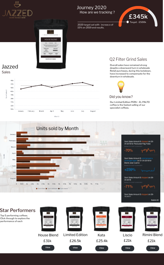
As the name suggests, this visual design departs from the usual little blocks of content with organised rows and columns. The clever use of inequality produces an ‘infographic’ style. Considered to be more engaging than traditional dashboard design.
A delightful but sparing use of colour with illustrations, produce intelligent dashboards where pertinent facts pop. The main elements really stand out, which is useful for focussing the eye of users in a hurry.
In terms of colour, be mindful of all users and ensure that your product is accessible for the visually impaired. Avoid gradient colours on important information: bar charts, line graphs and KPIs.
Visual cues in the form of icons can help to logically guide users through the dataset.
Analog gauges and 3D visuals are now out of style. Instead, try material and flat designs. Material adds gradient and shadows to create a sense of depth, whereas flat doesn’t use any.

Next, we discuss Data Storytelling.
In the meantime, we would love to hear from you. Please leave us a comment or question
Main image designed by Makyzz / www.freepik.com

