Categories
Analytics Business Intelligence Data Best Practice Data Insights Technology

With mobility less is more

When making a fast food order do we then expect to receive a 3 course gourmet meal?  Of course not, even if this may occasionally be a fleeting wish! So why do we get exasperated with the lack of detailed features on our mobile devices?

In the pursuit of instant access, product managers and developers are now required to keep remote workers quickly up to speed and agile. User experience for analytics on mobile and tablet devices is therefore a top priority. Their challenge is to somehow replicate the same relevant information that’s usually found on desktops.

Best practice for a ‘high level’ dashboard view requires a balance of context and relevance. The ability to slice and dice data, and clearly display charts on tablets is tricky, but even less amenable to mobile phones. As with all mobile apps, there is less screen ‘real estate’ available with only specific functions on offer. When users are on the move, mobile dashboards can only provide a ‘current status’ overview. Charts are minimal and the lack of ‘hover’ function allows for limited interactions.

In our recent blog post about data storytelling we explain how Yellowfin Stories instantly creates more relevant, interesting and better understood analytics. Another advantage to this tool is how it easily lends itself to mobile devices. Notice how social media apps successfully present stories in an easily digestible way, while still preserving the wider context. Yellowin Stories can mimic this with data mobility. Developers just need to consider size restrictions and be mindful of which data to display and how it can be navigated.

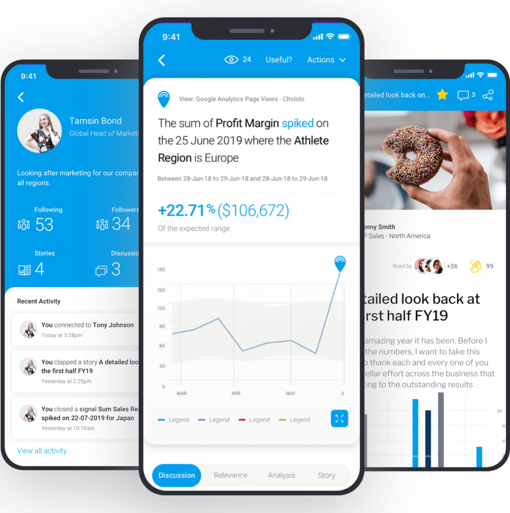
Better yet, why not have your BI platform automate data discovery by trawling your business data for statistically significant changes, notifying users of those relevant to their role. This type of ‘news flash’ data can be presented without the need for specific dashboard or ‘card’ design, meaning that trend changes, period comparisons, spikes, dips and more can be accessed from mobile devices.

Find out how RhinoIT can help you unlock meaningful insights from your data.
With mobility less is more RhinoIT
Yellowfin Mobile App

Next, we discuss Preparation.

In the meantime, please leave us a comment or question

Main image designed by rawpixel.com & starline / www.freepik.com

Categories
Analytics Data Best Practice Data Insights Data Visualisation

Once upon a time series

‘Tell me a fact and I’ll learn. Tell me a truth and I’ll believe. But tell me a story and it will live in my heart forever.’ 
– Native American Proverb.

Since childhood stories have shaped our view of the world. Expanding our imagination and introducing us to new ideas to deal with real life situations. By triggering our emotions they provide meaning and purpose, linking us all to universal truths that transcend generations. People are motivated to engage with and share a good story, if it authentically connects to the core of an experience.

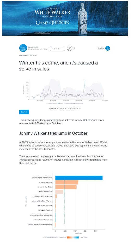
When presenting data why not create intrigue and, dare we say, excitement by adopting a ‘storytelling’ approach to your dashboards. In this way you can slowly build up critical information, helping users to understand the wider business purpose and overall picture.

We don’t suggest penning a novel, bear in mind that the message needs to be clear, simple and focussed. However, a little artistic flair can go a long way in capturing the attention of your audience by depicting the whole narrative of key performance indicators.

That’s why we advocate the use of Yellowfin Stories.

By combining real-time accessible data with insight, context and explanation, this Business Intelligence tool makes analytics instantly more relevant, interesting and better understood. Whether you are giving a presentation or people are reading a data story, it really is the best way to share and collaborate on a single source of accurate, credible and secure information.

Plus anyone with a meaningful message can easily compose and share a Yellowfin Story. The simple interface springs data into life with images, video and embedded reports from other dashboard vendors.

Once upon a time series RhinoIT
Created in Yellowfin Stories

Next, we discuss Mobility.

In the meantime, we would love to hear from you. Please leave us a comment or question

Main image designed by Jannoon028 / www.freepik.com

Categories
Data Best Practice Data Visualisation

Prepare to visually impress your audience

It’s a tough break for modern software applications. To be considered a catch they need to have it all: good looks, brains and wealth!

That’s why great dashboards with visually stunning insights, actionable information and rich analytics are a key requirement.

The question is: “How do you transform puzzling data into transparent and meaningful business decisions. Actions that resonate with users?” 

Too much swagger with limited practicality is the classic ‘style over function’ trap.

Effective dashboards require a careful selection of useful data. Striking a balance between being sufficiently actionable and overly cumbersome to view.

RhinoIT are keeping a close eye on the emerging trends for dashboard designs. This is the first in a series of posts where we share our thoughts on the most popular ones. First under the microscope is Asymmetrical Design.


Asymmetrical Design

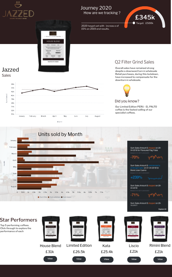
As the name suggests, this visual design departs from the usual little blocks of content with organised rows and columns. The clever use of inequality produces an ‘infographic’ style. Considered to be more engaging than traditional dashboard design.

A delightful but sparing use of colour with illustrations, produce intelligent dashboards where pertinent facts pop. The main elements really stand out, which is useful for focussing the eye of users in a hurry.

In terms of colour, be mindful of all users and ensure that your product is accessible for the visually impaired. Avoid gradient colours on important information: bar charts, line graphs and KPIs.

Visual cues in the form of icons can help to logically guide users through the dataset.

Analog gauges and 3D visuals are now out of style. Instead, try material and flat designs. Material adds gradient and shadows to create a sense of depth, whereas flat doesn’t use any.

Prepare to visually impress your audience RhinoIT
Created using Yellowfin 9.2.2 canvas dashboard and code mode

Next, we discuss Data Storytelling.

In the meantime, we would love to hear from you. Please leave us a comment or question

Main image designed by Makyzz / www.freepik.com