‘Tell me a fact and I’ll learn. Tell me a truth and I’ll believe. But tell me a story and it will live in my heart forever.’
– Native American Proverb.
Since childhood stories have shaped our view of the world. Expanding our imagination and introducing us to new ideas to deal with real life situations. By triggering our emotions they provide meaning and purpose, linking us all to universal truths that transcend generations. People are motivated to engage with and share a good story, if it authentically connects to the core of an experience.
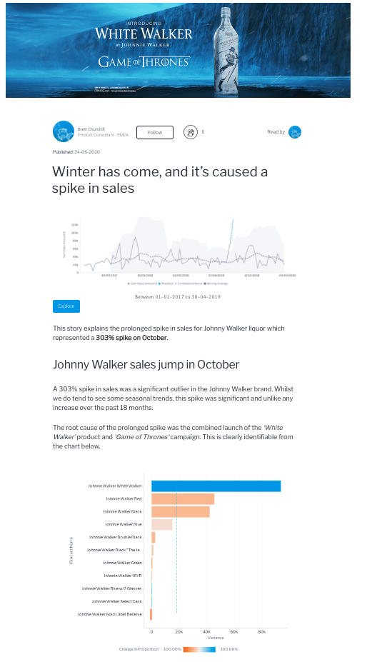
When presenting data why not create intrigue and, dare we say, excitement by adopting a ‘storytelling’ approach to your dashboards. In this way you can slowly build up critical information, helping users to understand the wider business purpose and overall picture.
We don’t suggest penning a novel, bear in mind that the message needs to be clear, simple and focussed. However, a little artistic flair can go a long way in capturing the attention of your audience by depicting the whole narrative of key performance indicators.
That’s why we advocate the use of Yellowfin Stories.
By combining real-time accessible data with insight, context and explanation, this Business Intelligence tool makes analytics instantly more relevant, interesting and better understood. Whether you are giving a presentation or people are reading a data story, it really is the best way to share and collaborate on a single source of accurate, credible and secure information.
Plus anyone with a meaningful message can easily compose and share a Yellowfin Story. The simple interface springs data into life with images, video and embedded reports from other dashboard vendors.

Next, we discuss Mobility.
In the meantime, we would love to hear from you. Please leave us a comment or question
Main image designed by Jannoon028 / www.freepik.com

