Categories
Analytics Big Data Business Intelligence Data Best Practice Data Insights Data Visualisation

Are you ready for embedded and contextual analytics?

If you are considering embedded or white-labelled analytics solutions, this post will help to explain why it’s paramount for you to first understand the analytic capability of your software before taking action.  

As a product manager, you will need to determine what constitutes a Minimum Viable Product (MVP) before launching it. It is critical to first examine the existing software’s analytical capability and address areas for improvement. 

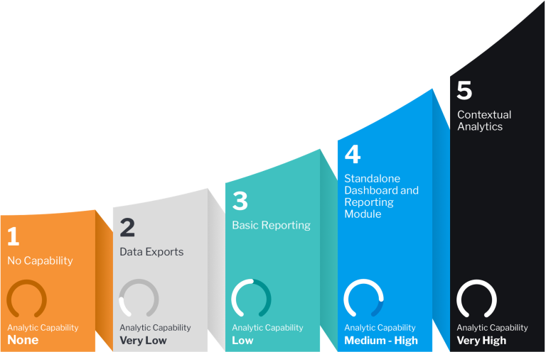
The ‘Embedded Analytics Maturity Curve’ is a useful strategic assessment framework that product managers and software owners can use to help plan out their implementation. It outlines defined phases of the overall product journey, and can be used as a roadmap to formulate analytical development, adoption and long-term strategy. 

This visual framework focusses on the usability of business intelligence analytics, and maps out the development effort required to reach the desired target.

The curve indicates the ideal trajectory of an analytics solution. As the product matures, it’s analytical capability and data value increase, ultimately becoming a more sophisticated piece of software.
Are you ready for embedded and contextual analytics? RhinoIT

By following this structured progress model, you can better determine and learn:

  1. The evolution of your analytics product
  2. Where improvements are required to move it to the next stage of maturity
  3. How the final product will deliver value through automated in-context workflows, reducing effort for both the developer and end user.

ANALYTICS MATURITY STAGE 1 – No Capability

If you are at the beginning of building a Minimum Viable Product (MVP) and getting it ready for market, then you are at stage 1 of the analytics maturity curve. At this stage your software is likely to be purely transactional, without methods to analyse data such a dashboards and reports.

You may have decided to ship your product, perhaps as a proof of concept, with the intention of including analytic functionality in the future. However, what’s important to consider here is the user’s requirements, because these analytic constraints may pose severe problems when trying to introduce sophisticated features later on.

Key reasons to evolve:

  • clients are demanding more access to their data
  • you’re losing to competitors with reporting and data access API capabilities
  • lack of access to data and insights is the reason for lost deals

Signs that you’re ready for the next stage:

  • you have a good grasp of client’s information needs
  • you have the required data platform expertise within your organisation
  • your data structure is stable

ANALYTICS MATURITY STAGE 2 – Data Exports

At this stage you are providing data export tools such as CSV downloads or API access. This is to cater for clients that now recognise the need for report building and data consumption to guide their decision-making.

If your users can only access their data using an external solution then this presents limitations. It means they need to build their analysis from scratch and manage the data pipeline outside of your software. The disparate nature of the analytic experience becomes burdensome and time-consuming. Plus, the data is in its’ raw format, which may not represent an accurate picture for meaningful insights.

Exporting a CSV from your software and uploading it to a third-party BI tool for analysis, requires a user to keep switching back and forth between the two for data context. This creates a disjointed experience overall and without guidance on how and where to start, they could become easily frustrated.

Key reasons to evolve:

  • clients are integrating data into their own reporting solutions but struggling to build meaningful reports
  • you want to charge for data access but data exports provide little value to justify this

Signs that you’re ready for the next stage:

  • you have access to resources who understand your data model and can define and build basic reporting
  • you have a clear set of basic reporting requirements from your user base that is common across many clients
  • you have an underlying data structure that can accommodate reporting workloads without impacting performance

ANALYTICS MATURITY STAGE 3 – Basic Reporting

This stage is typically marked by the introduction of an in-house developed analytical solution or basic operational reporting capabilities, where users can build basic parameter-driven reports within an application. However, the set of dashboards and reports options are usually limited, and users cannot create their own custom analysis.

The user’s need to make quick decisions, based on reliable insights that are immediately available creates a new challenge. Requests for new reports mean that developers can struggle to keep up with demand. This can potentially slow down development of the core product.

Key reasons to evolve:

  • your clients are requesting more sophisticated insights
  • your clients want to give access to senior management and tabular reports don’t cut it
  • competitors are innovating with data and have a more targeted sales and marketing approach

Signs that you’re ready for the next stage:

  • you are able to define and measure KPIs in your data that are common across clients
  • you can define views of your data that can be combined into executive or operational dashboards
  • you understand what your competitors are offering and how you can match their offering or create a new unique selling point

ANALYTICS MATURITY STAGE 4 – Standalone Dashboard and Reporting Module

And now for the embedding of real-time reports, dashboards and data visualisations into your software!

This is where you can offer a true self-service reporting experience that enable users to create their own bespoke analytic content, using pre-defined, secure data sets.

Clients will have better access to data via standalone modules (dashboards/reports) with the ability to create bespoke reports, which frees up the developer’s time. Business Intelligence analytics become more feature-rich and user-friendly, providing higher value for users and reduced workload for your development team.

The challenge at this stage is to ensure users make optimal use of your embedded software. You need to ensure that they remain focussed within your application, without having to switch to external sources for context. The easier it is for them to discover insights, the less likely they will be distracted from their workflows.

Key reasons to evolve:

  • having a competitive edge in your analytics offering is essential to your strategy
  • you may have churned customers to competitors looking for greater analytics sophistication
  • you see key advantages for your users in enabling analytics at the point of consumption

Signs that you’re ready for the next stage:

  • your data model is highly mature and performant
  • you have mature data and analytics capability or partners who provide that skillset
  • you have UX expertise that can help design and combine analytics into your core application workflows

ANALYTICS MATURITY STAGE 5 – Contextual Analytics

You’ve made it – embedded analytics takes a giant leap into contextual analytics!

Integrating components like, charts, tables, dashboards, alerts, and visualisations. Delivering them directly in the user’s interface and core transaction workflow.

Users have access to relevant data and insights in real-time, right at the point when they need to take timely action. They may not even realise they’re using analytics because much of the data will be pre-defined, automated and seamless.

Contextual analytics is really the best way to fully optimise the use of your core software and future-proof it. Providing a high quality experience to users significantly increases the business benefits for everyone.

Improving your chances for maturity 

Progressing through the five stages of the embedded analytics maturity curve is a journey not a race, and can be achieved by every team regardless of their data skills.

A critical assessment of your current analytics capabilities and areas for improvement is the critical first step. Being clear about how well your software meets the curve criteria, what value it offers business users and where it may fall short.

It may be useful to look at lessons learned from other mature organisations in similar industries. Their successful use cases can inspire your own product initiatives.

Achieving an exceptional analytics offering is reliant on aligning your product’s data maturity and embedded maturity. You can’t try to get to Stage 5 insights while your data is at Stage 2. Start to prepare your data ahead of migration. Don’t limit yourself to just one stage, look further still, right to your end goal.

Get ready for embedded and contextual analytics 

Ultimately, taking the time to examine the state of your data, people and technologies in-depth can provide valuable guidance in maturing your software’s analytical capabilities, and even be a much needed wake-up call.

With the availability of modern solutions like Yellowfin that make the adoption and implementation of embedded and contextual analytics as seamless and streamlined as possible, there is no better time to begin assessing your product’s current analytical maturity.

Talk to us to find out how you can start planning the introduction of new and innovative features that will transform the way your users engage with data, and make better informed decisions sooner.

Categories
Analytics Big Data Business Intelligence Data Insights Data Visualisation

Holistic reporting made possible with data blending

In today’s digital age, organisations rely on the ability to understand their growth opportunities and market forces at a glance. They need quick access to a holistic view of their business. 

This can be made possible when they have the ability to gather, store, process, analyse and interpret data from a centralised system. From this one source of truth their data can maintain its quality and consistency across the enterprise.

One of the biggest challenges today is for organisations to find the best way to integrate information from all the various disparate sources into one accurate and unified solution. The good news is there are best practices that can be followed to create an accurate single source of the most up-to-date insights.

Common data integration challenges

Every organisation has unique and complex analytical needs, which means it can be quite tricky to make data integration a reality. Some of the many data blending obstacles tend to be:

  • aligning existing analytics technology with quality of data sources
  • data warehouse and integration compatibility issues
  • restricted reporting ability due to non-comprehensive integration approaches

An effective way to overcome these is to match reporting requirements with desired data sources, rather than to specific technologies.

Make IT count

End-to-end data integration processes can take a while before any definable ROI is possible. To speed this up organisations should aim to create a more effective integration strategy that will:

  • map the entire data infrastructure
  • merge disparate data sources into one unified solution
  • create essential dashboards to produce advanced reporting
  • implement advanced data analytics functionality

To achieve quick results it first requires a focus on the critical components, which can then be scaled-up as required. The benefits of this approach are:

  • ability to test real-time accessibility and functionality
  • gaining team buy-in with strong use cases that have been developed before scaling begins

Change is as good as a rest

Centralising data can be a massive undertaking for business operations. That’s why choosing the right BI analytics solution is key for successful data integration. Done right, centralised data can empower end users to abandon legacy systems and gladly accept innovative ones.   

Rhino Analytics can help you achieve:

  • interactive analysis 
  • batch ETL
  • app analytics
  • ad-hoc SQL querying
  • reports and dashboards
  • ETL Queries
  • data lake analytics

Conclusion

Connecting disparate data sources into one holistic solution is easier with the right BI solution. In this way organisations can build their analytics systems around their own unique data needs rather than be restricted by specific technologies.

Shifting focus to prioritise key functionality that can ultimately be scaled-up will help minimise business disruption. Resulting in a clearer view of all data, increased ROI and customer/employee satisfaction. 

Find out how to simplify your data analytics with tried and tested solutions from a team who really care about your success.  Contact hello@rhinoit.co.uk

Categories
Analytics Big Data Business Intelligence Data Best Practice Data Insights Data Visualisation

Let Natural Language Query be your guide

Natural Language Query (NLQ) allows a user to enter search terms or phrases as if they are speaking them naturally. This includes statements, questions or a simple list of keywords. 

NLQ is a self-service BI capability that allows non technical users to ask questions of their data and receive a chart or report that answers their query, providing a deeper level of understanding. NLQ tools come in different forms and levels of integration, varying between software vendors.

Some platforms incorporate voice interaction, or querying data using a virtual personal assistant. The most common approach in the market is currently search-based NLQ. This is where users enter a query in a search box located within the BI interface, the tool parses the keywords, matches them with elements in known and/or related databases and shows a result.

The latest approach is Guided NLQ – where the programmed analytics solution acts as a guide, offering users pre-defined sequences and suggested prompts to help structure their query.

Guided NLQ take users step-by-step, making it simple for anyone in the organisation to ask complex questions of their data by:

  • formulating the type of question
  • building it with field auto-complete and automated filter selections 
  • adding the answer to other analytic content in a seamless workflow

It’s easy to set up, ask questions and get instant results. Non-technical users can forge their own path through with any question they wish, choosing the suggested options that are offered to them.

A truly unique self-service experience

Yellowfin is a BI tool that offers Guided NLQ capability. When a user selects a data view (dataset) they wish to query, it provides a question bar they can type into with a preset list of possible questions to choose from. The type of questions offered will be basic or complex depending on the query. The user is automatically shown relevant options in a drop down menu and dynamically prompted with further suggestions as they type.

Rather than using technical jargon, generic business terms such as ‘compare’ or ‘list’ will be highlighted as these are familiar. These important elements will lead a user in a more logical way where the meaning of their language cannot be missed, unlike using a free text search. Once the query is built, Guided NLQ presents the ideal visualisation (chart) and tabular report based on data best practices.

Unlike traditional BI analysis, these generated answers will likely reveal deeper insights by uncovering hidden patterns, trends, outliers or shifts in behaviour. From here, users can:

  • go back and rearrange the question at any stage
  • change data views to explore more answers from other datasets
  • update existing content within Yellowfin dashboards, presentation and stories with the generated answers
  • save the question for later

There’s no need to worry about using the right terminology because this tool quickly generates the most popular search dimensions to help users get started. They can even click ‘show more’ to see all available fields within the data view. The reliance on experts can be dramatically reduced when everyone in the business can search for their own answers!

There’s no such thing as a daft question

With Yellowfin Guided NLQ, there’s no need to continuously train the solution to understand users, or keep feeding it synonyms and word dictionaries. Luckily the metadata layer bypasses this problem.

The metadata layer is called a View, which is virtualised because it sits between the data source and all the dependent analytic content. This layer defines all relationships between tables, accessible fields, field type and formatting. Meaning that users creating analytic content can use the relationships and fields defined in the View without having to understand the underlying logic.

Unlike traditional search-based tools, Guided NLQ ensures that each piece of query text is recognised and understood by the system. With guided options offered, ambiguity and misunderstandings become a thing of the past.

Feel free to ask

Guided NLQ implements thousands of comprehensively modelled question types and sequences for every conceivable question combination. Basically, anyone can ask anything! 

Yellowfin Guided NLQ can support complexities such as:

  • Tabular and cross-tab reports
  • Automatic highlighting of items on charts, such as outliers, values and trends
  • Complex filter construction
  • Set analysis comparison, ranking and calculations
  • SubQueries, including minus and intersect

So, whether it’s a basic question: “What is the comparison of annual business performance?” OR a more complex one: “Which accounts have increased revenue month over month for a specified SKU?”. The tool has you covered because it’s been specifically built to accommodate a multitude of queries. 

One integrated solution

A major benefit of using Yellowfin Guided NLQ is that it’s fully integrated with the Dashboard, Stories and Presentation functionality. Simplifying the generation and collaboration of new and existing analytic content. In addition, the feature supports multiple languages, leverages the same security model as the rest of the platform and enables multi-tenant to suit various deployments.

Users no longer need to swap in and out of different systems. The integrated nature of this tool makes for a more streamlined workflow:

  • Self-service ad-hoc reporting for non-technical users with helpful data discovery methods such as Assisted Insights and Signals, means less reliance on an analyst
  • Adding answers to analytic content, simplifying the creation of dashboards, data stories and reports
  • Faster ways to create and share complex reports for analysts and subject matter experts

Users who are creating content within Dashboards, Stories etc. can easily access Guided NLQ from those builders, dropping in generated answers seamlessly. Overall, a more powerful analytics experience, lending itself to all self-service BI preferences.

Guided NLQ is for everyone

Yellowfin Guided NLQ is designed to be easily embedded. Whether it’s a CRM, HR/Payroll or Finance system. It can be used independently or plugged into any apps and launched from anywhere.

As a stand-alone module, it’s not tied to a user interface or single data set. Just curate a view and drop in NLQ capability for a quick and easy self-service deployment. It’s API-enabled to provide fine tuning, this way user experience can be controlled based on scope and relevance.

Yellowfin Guided NLQ is useful for:

  • Independent software vendors, as a flexible, white label feature. Reducing support burden while enhancing product value.
  • Enterprises, give all business users (analysts and non-technical) self-service ability. Freeing up time and resource.

DIY Business Intelligence is vital

As analytics continue to permeate every aspect of business activity, self-service BI applications are becoming vitally important to a broader range of users. Currently very few people are trained in analytics and those who are, quickly become involved in large-scale projects.

Guided NLQ will change the way BI is distributed and used by everyone in fast moving enterprises. The ultimate goal is to achieve user self reliance. Providing them access to fast, accurate and easy to use analytics solutions. Freeing up the data experts to delve into more complex analysis and uncover further insights to improve business performance.

As leaders you may well ask the question: “How can we better understand our business and ensure its long-term growth?” The answer is: Guided Natural Language Query.

“AI is maturing quickly and starting to create opportunities that never existed before. Autonomous vehicles, for example, have the potential to transform societies and create entirely new kinds of businesses. But AI-powered business transformations can happen at a smaller scale, as well.”
– Maria Korolov, Contributing writer of CIO IDG Communications: The Voice of IT Leadership, March 2022

Request a demo: hello@rhinoit.co.uk to see this innovative software product in action.

Categories
Analytics Business Intelligence Data Insights Data Visualisation

Once upon a time series (data storytelling)

Storytelling is an innate human skill and yet data storytelling is still an emerging concept!

By 2025, Gartner predicts data stories will be the most widespread way of consuming analytics. It’s a key part of modern analytics your business cannot afford to overlook.

Data storytelling is a method for communicating analytical information with a compelling narrative. Offering consumers valuable context which is memorable. It’s suited to all knowledge levels – business users and subject matter experts alike.

With data storytelling all users can:

  • Provide context and relevance around the numbers
  • Inspire discoveries in data with meaningful purpose
  • Make information much more memorable and comprehensive for everyone

For example, take a typical retail dashboard that presents annual sales revenue for stores worldwide. Ordinarily it would be left to the individual to glean their own interpretations. However, with storytelling to explain the nuances, it reveals that one region’s spike in sales was attributable to seasonal factors.

Automatically, there is a greatly enhanced depth of understanding and more people able to derive the intended value from the data.

Stories are more than just a data description

As business leaders you need to base your strategic goals on more than just numbers. You require a holistic viewpoint, interpretations that make sense and an extra layer of detail to draw upon. A data story that adds expert opinion, past-experience and insight is what motivates the audience to take action.

The aim might be to surprise, delight or even alarm. In any case, bringing ‘big picture’ information to the forefront of your reporting is key to fully engaging your decision-makers.

Data acts as the trigger for creating a story, narrative is an anchor, but context is the magic ingredient to develop understanding.

Common use cases for storytelling tools

Modern embedded analytics platforms offer several narrative-building features which combine real-time data with rich information presentation options, without having to switch to using other tools.

This area of analytics is core to the Yellowfin suite, providing two useful products – Stories and Present – where users can build narrative-based reports and presentations within the same interface they build dashboards.

Built-in analytics features enable end-users to create and share knowledge and insights using long-form narrative. Augmenting their story with rich data (charts, reports) and non-data content (text, images, videos).

Useful when creating:

  • operational reports
  • multi-project data discoveries
  • employee blogs and reports
  • external partner and client reports

Make your data stories compelling

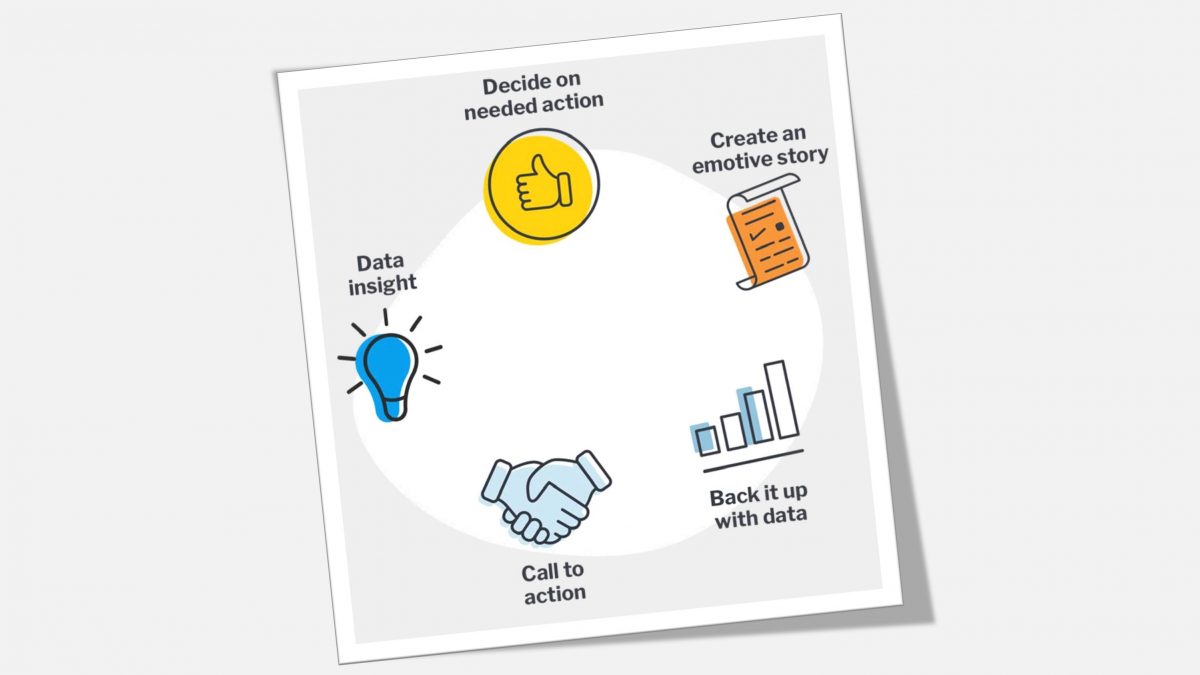
The primary aim of any data-driven narrative is to move people emotionally, and then back up their understanding with the facts. It reveals a truth that you need to communicate.

It could be in one long story format providing an overview, or multiple shorter snippets as you make your way through a set of facts. The point is to make it memorable and personal so that it resonates with your audience.

Here’s what to consider when forming your narrative:

  • What does the data tell you?
  • Is it a noteworthy change, pattern or trend over time?
  • Is it a lesson in what ‘not’ to do?
  • Is it a fact not widely known but one that people should be aware of?

Know your audience

Take time to consider the different types of people consuming your data and it’s context. Empathise with your audience and tailor the narrative and presentation according to their needs and understanding.

For example, if you’re presenting to senior executives bear in mind that their time is a precious commodity. They just want to glean the significance of weighted probabilities to make high level decisions, so only provide short, punchy stories backed up with data that point to definitive conclusions.

Data led cultures require inspiring role models 

To successfully cultivate a data culture, leadership teams need to ‘walk the talk’.

As a leader it is your responsibility to become a data storytelling role model. By taking time to build a story and invite people on that journey with you, it empowers everyone in the business to start telling and sharing great stories. Together you can create a vision for the future, backed up by data that explains the strategy to achieving it including the what, why and how.

Traditional reports and dashboards simply don’t provide the full context for the data they share. By contrast, stories are incredibly powerful because they can evoke emotion and inspire a person to take action. It takes time to master the art, but when everyone understands challenges better and they can clearly identify opportunities for change, then business decision making becomes much easier.

Are you ready to persuade others to act on the insights you have discovered?

Tips on choosing the right analytics tool and how to successfully deliver your data stories can be found in our free eBook: ‘Once Upon A Time Series – Why Data Storytelling is Important’

OR why not see it in action and request a demo today.

Categories
Analytics Business Intelligence Data Insights Data Visualisation

Data tells the real story

Analytic users want to share meaning, not just a set of numbers.

For over 20 years, dashboards and data visualisation have been considered the best ways to explore, communicate and act on business data. However, as our data needs evolve in scope, our expectations on their capability will also require adjustment.

Dashboards originally started life as graphical interfaces. Designed to show a one-page snapshot of business performance, answering key questions like:

  • What is the current operational performance?
  • Are there any cost efficiencies to be had?
  • Which actions can I take?

Today, data is more complex and growing faster than ever before, yet many business users are still expected to manually extract data and find answers from high-level charts and dashboards. Unfortunately, these formats can’t always convey the full story behind the numbers or provide guaranteed actionable insights.

Data alone rarely makes sense – it requires context! It’s the story behind the numbers, that helps us understand.

We need more diverse ways to find and share meaningful stories. For this reason, data storytelling has become an influential new driver of analytics adoption.

Data Storytelling employs narrative techniques, pairing them with credible quantitative and qualitative data. This inspires better engagement where users acquire a depth of meaning that leads to proactive decision making. If the process is automated, this means everyone has access to important business information when they need it.

Business professionals need quick access to data-led insights

When attempting to dissect and analyse data for the purposes of making business decisions, data storytelling is the detailed explanation of what the numbers represent. People are likely to grasp narration far easier than sharing spreadsheets full of numbers or charts visualising key metrics.

Modern day Business Intelligence tools are now likely to include augmented analytic features. By automating aspects of the narrative process, users will find it easier and more efficient to analyse data and share relevant stores.

"25% of business leaders view data storytelling as one of the most important, emerging capabilities they want to have when selecting a new analytics solution."

- Gartner, 2021

Data-led stories solve manual processes

Automated data storytelling is gaining attention due to its ability to solve three emerging challenges of the largely human-driven, manual process that exists today:

  1. Stories need to be based on more than just human bias
  2. Data literacy and self-service limitations
  3. Scaling data storytelling across the business

Of course, this all hinges on having Business Intelligence software able to apply these technologies and generate stories in a way that does not seem too algorithmic to the reader.

If you want to know more about the shift from static dashboards to contextual insights

Click here to download your free eBook

This educational guide will help you understand:

  • What automated data storytelling is 
  • How augmented analytics and data storytelling benefit organisations
  • Why leveraging automated narrative is the future of analytics
Categories
Analytics Big Data Business Intelligence Data Insights Digital Transformation

Transforming PIM

RHINOIT ANNOUNCES PARTNERSHIP WITH DELTEK

Enhancing Project Information Management systems with smart analytics

MILTON KEYNES – 12 May 2021 – RhinoIT Business Intelligence Solutions, a technology company helping organisations transform data into insight, is delighted to announce their partnership with Deltek, the leading global provider of enterprise software and solutions for project-based businesses.

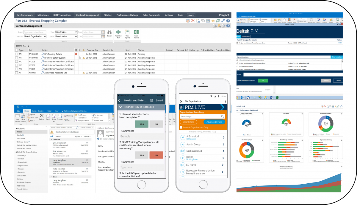
Deltek Project Information Management (PIM) is a solution for architecture, engineering, and construction firms to access project information in one central location saving time with easy access to project emails, documents, and drawings. The central location aids in reducing corporate risk and improving team collaboration.

RhinoIT already work with customers who have deployed PIM. Together they have successfully built smart and agile data reporting systems, tailored to unique requirements and providing real-world functionality. Becoming a Deltek partner will further enhance RhinoIT’s service capability, making it possible to offer specialist knowledge in PIM.

“By combining leading edge technology with specialist Business Intelligence expertise, our goal is to help organisations drive meaningful change,” said Carl Edwards, CEO of RhinoIT. “We can help clients enhance existing report systems by transferring PIM data into their BI tool, and release constraints to include additional sources of data.” 

Learn more at www.rhinoit.co.uk/deltek-pim

Categories
Analytics Big Data Business Intelligence Data Insights Data Visualisation Digital Transformation

Insights that find you

Rhino Data Insights (RDI) is our full suite Business Intelligence platform with automated insights and smart analytics. A ‘one-stop’ integrated solution with Yellowfin at its core.

Our BI experts have built up practical ‘know-how’ on what works. We love sharing these valuable lessons with clients and have proven that any BI infrastructure can be up and running in 5 steps.

RDI tried and tested process of transforming data into insight:

  1. Discover – establish BI needs and map out effective strategy
  2. Identify – connect with key stakeholders to ensure successful implementation
  3. Structure – configure the appropriate BI environment (cloud/on premise)
  4. Systems – understand data sources and ensure they work collaboratively
  5. Implement – continue to monitor effectiveness and plan out further enhancements as and when necessary.

In our previous post Build meaningful data we explained how many UK construction companies are already working with us to release the full potential of their BI software. These companies, like so many, use large amounts of data.

To pick out every single insight can be a complex and time-consuming challenge. RDI can help solve this issue!

RDI incorporates a fantastic feature called ‘Signals’. Our BI experts can advise you on how to make use of machine learning and AI to further enhance your data analysis.

Signals is a standalone product that can work alongside your existing BI tool and provides reasoning behind obscure data findings. It automatically monitors your data so that you know when and why important changes happen to your business. Combined with actionable dashboards you can make more informed decisions.

For the known – you can receive notifications for custom alert conditions when threshold values are hit.

For the unknown – Signals uses automation and AI to trawl your data for statistically significant changes, notifying you of the ones that are relevant.

Trend changes, period comparisons, sudden spikes, dips and other outlier metrics come complete with plain English explanations. With additional analysis on correlated data changes that help you quickly get to the root cause.

There’s no need to build a report or dashboard to track every possible data combination – just point Signals directly at your data source –  and let insights find you!

Would you like to uncover hidden data and further enhance your business analysis? Please contact ian.l@rhinoit.co.uk

Categories
Analytics Big Data Business Intelligence Data Insights Data Visualisation Digital Transformation Technology

Transforming debt prevention

We are proud to be Technology Partners with newly launched company Connected Data. An exciting innovation that offers data-driven Business Intelligence solutions, transforming the way organisations prevent and reduce debt. 

This project is a perfect example of our expertise in building bespoke software that makes a meaningful difference to the finance industry. Making it possible to blend latest, trending customer data with AI driven data analysis to provide a unique portfolio platform.

The Connected Data story is covered in more detail in Credit Connect, Credit Strategy and CCR Magazine

Categories
Analytics Business Intelligence Data Insights Technology

Take flight or gain ground

As an organisation that attempts to keep pace with emerging trends, your constant consideration will be how to best manage software technologies, and where to access them. Currently, you have two options:

1) Cloud/SaaS – online services hosted by third parties. There are many advantages to this model such as predictable/affordable costs, up-to-date software and freeing up in-house IT resource.

2) On Premise – onsite hardware with dedicated IT resource. You remain in complete control of data security and compliance. Deciding on how systems are configured and when upgrades/changes take place. Improved business continuity with less reliance on internet connectivity and other external factors.

Regardless of approach, you are moments away from achieving robust Business Intelligence solutions. Working alongside your reporting team, our BI experts offer simple steps to creating effective reports, views and dashboards using Rhino Data Insights.

For meaningful data insights and a full 361 business view – because we always go that little bit extra! 

Please contact: ian.l@rhinoit.co.uk

Categories
Analytics Business Intelligence Data Insights Data Visualisation

Build meaningful data

Many construction companies in the UK are already working with us to release the full potential of their Business Intelligence software. By creating insights from multiple data sources, they now have a holistic view of organisational performance, which can be easily shared with stakeholders and senior management.


In a recent London apartment development project, we created a tailored 3D view, colour-coded, build and fix status, where data reports were delivered straight to onsite teams via their handheld device. Our analytics are already built-in (embedded) so all modules; Project, Task, Document, Asset, and Process Management can be found under one roof.

Build meaningful data RhinoIT 

RhinoIT specialise in Business Intelligence consulting, developing and embedding. Our Bespoke BI solutions ensure that all the information required is displayed on easily accessible Dashboards. The user never has to exit the application into another tool.

Would you like to find out what’s hidden in your data, and why?
please contact: ian.l@rhinoit.co.uk